On (re)Structuring
How thematic and chronological structures coexist

Previously in Editing is hard I explained why "we are we are attempting to break the Eurocentric (chronological) spine of history" with the new edition of Meggs' History of Graphic Design (MHOG7). In this post I'd like to elaborate on how we are doing this and what shape the new book is taking.
A quick note: writing and restructuring continues to be an evolving process. We experiment, test and adapt frequently. And there is major factor in how/why we are working this way: helping previous readers and teachers adapt to what appears to be an entirely new book. We remind ourselves every step of the way that we are writing a new edition, not a new book.
We hope that this restructuring will make history more porous and relatable. The items below are strategies we are using to allow readers familiar with the text to reorient, while allowing new readers to begin anywhere, quickly situating what they are exploring into a broader context.
Chronology in chapters
We are not giving a hierarchy to the events and examples we use to explain the motivation defined in a chapter. But we do want a consistent approach to the order of information used by all the chapters. While the overall sequence of chapters is not chronological, each chapter is its own timeline progressing from earliest example to most recent. We begin by establishing a foundation, and add subsequent ideas and figures.
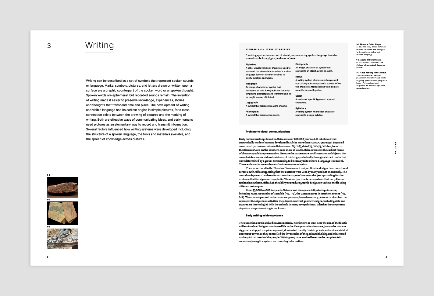
For example, the 'Writing' chapter begins with the practice of early mark making and moves through time describing how language and writing built upon (or was devised in parallel) earlier cultures and practice. Here's the list and progression of subheads from that chapter:
- Prehistoric visual communications
- Early writing in Mesopotamia
- Early writing in Mesoamerica
- Egyptian hieroglyphs
- Cretan pictographs
- The North Semitic alphabet
- African writing systems
- The Aramaic alphabet and its descendants
- The Greek alphabet
- The Latin alphabet
- The Korean alphabet
- Chinese scripts
- Cherokee syllabary
Visual footnotes
Locating figures and captions in textbooks is always a challenge for author, reader and designer. In order to promote good reading flow and to maximize the size of images, related imagery may fall on different pages than where they are referenced in the text. Figure numbers are used to help readers match the figure in the text to the actual image.
One of our goals with the new edition is to make all the images larger. To do this, we are including small visual footnotes (ie. thumbnail images) next to the text, and as well as combining images into compositions that allow readers to compare, contrast, question, or just simply appreciate how a motivation can be expressed in different ways.
Sidebars
With every chapter being presented as an individual timeline that articulates the development of the motivation it is describing, there's an issue: many individuals, movements and examples have many motivations. Dada and Dadaist graphic design were motivated by many aspirations including inventing, mobilizing, criticizing, and even refining.
A benefit of a chronological history is that all information related to a movement can be placed together in time. But with 12 timelines—each describing a different motivation—this isn't so simple.
We are writing a single historical overview of each movement and its pioneers, placing it in a numbered sidebar. Where these reside in the book, we're not sure yet. But, any time a movement is a part of a chapter, we will refer readers to the sidebar for broad context, while describing how the movement specifically relates to the motivation in the chapter text.
Timeline
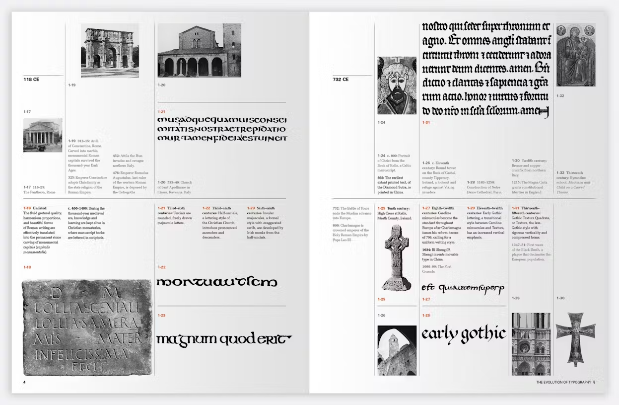
The 6th edition of MHOGD includes timelines at the beginning of each chapter. We love timelines—visual timelines. To get a bird's-eye view of when events in the book occurred we are including a multi-page timeline that not only displays significant developments in graphic design, but also situates them among cultural benchmarks throughout time.

Overview of graphic design history
In many ways a companion to the Timeline, the book begins with a concise description of events that have brought us to the graphic design we make now. This overview is chronological and is a text-based way for readers to briefly discover the progression events, ideas, technologies and places that add up to how and why design is made.
What do you think? Do the changes and strategies we are employing make sense? Are they beneficial?
Sign up for an account to comment or add thoughts. We'd love to hear from you!